 وب سایت علمی تخصصی nCIS
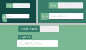
 استفادهی همیشگی ظاهر پیشفرض مرورگرها برای عناصر HTML، نهتنها موجب خستگی بینندگان میشود، بلکه تفاوتهای جزئی اجرا و نمایش در مرورگرهای مختلف ممکناست منجر به نارضایتی کاربران و ایجاد یک تجربهی کاربری نامناسب گردد. در این پست، یک فایل CSS برای زیباسازی TextBox بصورت حرفهای برای شما آماده کردهایم تا متناسب با نیازتان، از آن در طراحی قالب استفاده کنید. این فایل منجر به تولید TextBoxهایی در دو نوع متحرک و سهبعدی میگردد.
برای مشاهدهی سورس کد، ادامهی مطلب را مطالعه فرمایید.
زیباسازی TextBox – قالب CSS :
برای استفاده از این قالب، کد CSS زیر را در مسیر موردنظر ذخیرهنمایید:
@import "compass/css3";

@import url(https://fonts.googleapis.com/css?family=Open+Sans:400,700,600,300,800);

* {
  box-sizing: border-box;
}
html,
body {
  overflow-x: hidden;
  font-family: "Open Sans", sans-serif;
  font-weight: 300;
  color: #fff;
  background: #efefef;
}
@mixin epic-sides() { // https://codepen.io/MichaelArestad/pen/qltuk
    position: relative;
    z-index: 1;

    &:before {
        position: absolute;
        content: "";
        display: block;
        top: 0;
        left: -5000px;
        height: 100%;
        width: 15000px;
        z-index: -1;
        @content;
    }
}
.row {
  max-width: 800px;
  margin: 0 auto;
  padding: 60px 30px;
  background: #032429;
  @include epic-sides() {background: inherit;}
  text-align: center;

  &:first-child {
    padding: 40px 30px;
  }
  &:nth-child(2),
  &:nth-child(8),
  &:nth-child(10){
    background: #134A46;
  }
  &:nth-child(3),
  &:nth-child(7) {
    background: #377D6A;
  }
  &:nth-child(4),
  &:nth-child(6) {
    background: #7AB893;
  }
  &:nth-child(5) {
    background: #B2E3AF;
  }

  span {
    position: relative;
    display: inline-block;
    margin: 30px 10px;
  }
}
.basic-slide {
  display: inline-block;
  width: 215px;
  padding: 10px 0 10px 15px;
  font-family: "Open Sans", sans;
  font-weight: 400;
  color: #377D6A;
  background: #efefef;
  border: 0;
  border-radius: 3px;
  outline: 0;
  text-indent: 70px; // Arbitrary.
  transition: all .3s ease-in-out;

  &::-webkit-input-placeholder {
    color: #efefef;
    text-indent: 0;
    font-weight: 300;
  }

  + label {
    display: inline-block;
    position: absolute;
    top: 0;
    left: 0;
    padding: 10px 15px;
    text-shadow: 0 1px 0 rgba(19,74,70,.4);
    background: #7AB893;
    transition: all .3s ease-in-out;
    border-top-left-radius: 3px;
    border-bottom-left-radius: 3px;
  }
}
.basic-slide:focus,
.basic-slide:active {
  color: #377D6A;
  text-indent: 0;
  background: #fff;
  border-top-left-radius: 0;
  border-bottom-left-radius: 0;

  &::-webkit-input-placeholder {
    color: #aaa;
  }
  + label {
    transform: translateX(-100%);
  }
}
.clean-slide {
  position: relative;
  display: inline-block;
  width: 215px;
  padding: 10px 0 10px 15px;
  font-family: "Open Sans", sans;
  font-weight: 400;
  color: #377D6A;
  background: #efefef;
  border: 0;
  border-radius: 3px;
  outline: 0;
  text-indent: 60px; // Arbitrary.
  transition: all .3s ease-in-out;

  &::-webkit-input-placeholder {
    color: #efefef;
    text-indent: 0;
    font-weight: 300;
  }

  + label {
    display: inline-block;
    position: absolute;
    transform: translateX(0);
    top: 0;
    left: 0;
    bottom: 0;
    padding: 13px 15px;
    font-size: 11px;
    font-weight: 700;
    text-transform: uppercase;
    color: #032429;
    text-align: left;
    text-shadow: 0 1px 0 rgba(255,255,255,.4);
    transition: all .3s ease-in-out, color .3s ease-out;
    border-top-left-radius: 3px;
    border-bottom-left-radius: 3px;
    overflow: hidden;

    &:after {
      content: "";
      position: absolute;
      top: 0;
      right: 100%;
      bottom: 0;
      width: 100%;
      background: #7AB893;
      z-index: -1;
      transform: translate(0);
      transition: all .3s ease-in-out;
      border-top-left-radius: 3px;
      border-bottom-left-radius: 3px;
    }
  }
}
.clean-slide:focus,
.clean-slide:active {
  color: #377D6A;
  text-indent: 0;
  background: #fff;
  border-top-left-radius: 0;
  border-bottom-left-radius: 0;

  &::-webkit-input-placeholder {
    color: #aaa;
  }
  + label {
    color: #fff;
    text-shadow: 0 1px 0 rgba(19,74,70,.4);
    transform: translateX(-100%);

    &:after {
      transform: translate(100%);
    }
  }
}
.gate {
  display: inline-block;
  width: 215px;
  padding: 10px 0 10px 15px;
  font-family: "Open Sans", sans;
  font-weight: 400;
  color: #377D6A;
  background: #efefef;
  border: 0;
  border-radius: 3px;
  outline: 0;
  text-indent: 65px; // Arbitrary.
  transition: all .3s ease-in-out;

  &::-webkit-input-placeholder {
    color: #efefef;
    text-indent: 0;
    font-weight: 300;
  }

  + label {
    display: inline-block;
    position: absolute;
    top: 0;
    left: 0;
    padding: 10px 15px;
    text-shadow: 0 1px 0 rgba(19,74,70,.4);
    background: #7AB893;
    transition: all .4s ease-in-out;
    border-top-left-radius: 3px;
    border-bottom-left-radius: 3px;
    transform-origin: left bottom;
    z-index: 99;

    &:before,
    &:after {
      content: "";
      position: absolute;
      top: 0;
      right: 0;
      bottom: 0;
      left: 0;
      border-radius: 3px;
      background: #377D6A;
      transform-origin: left bottom;
      transition: all .4s ease-in-out;
      pointer-events: none;
      z-index: -1;
    }
    &:before {
      background: rgba(3,36,41,.2);
      z-index: -2;
      right: 20%;
    }
  }
}
span:nth-child(2) .gate {
  text-indent: 85px;
}
span:nth-child(2) .gate:focus,
span:nth-child(2) .gate:active{
  text-indent: 0;
}
.gate:focus,
.gate:active {
  color: #377D6A;
  text-indent: 0;
  background: #fff;
  border-top-right-radius: 3px;
  border-bottom-right-radius: 3px;

  &::-webkit-input-placeholder {
    color: #aaa;
  }
  + label {
    transform: rotate(-66deg);
    border-radius: 3px;

    &:before {
      transform: rotate(10deg);
    }
  }
}
.skinny {
  display: inline-block;
  width: 215px;
  padding: 10px 0 10px 15px;
  font-family: "Open Sans", sans;
  font-weight: 400;
  color: #377D6A;
  background: #efefef;
  border: 0;
  border-radius: 3px;
  outline: 0;
  text-indent: 75px; // Arbitrary.
  transition: all .3s ease-in-out;

  &::-webkit-input-placeholder {
    color: #efefef;
    text-indent: 0;
    font-weight: 300;
  }

  + label {
    display: inline-block;
    position: absolute;
    transform: translateX(0);
    top: 0;
    left: 0;
    padding: 10px 15px;
    text-shadow: 0 1px 0 rgba(19,74,70,.4);
    transition: all .3s ease-in-out;
    border-top-left-radius: 3px;
    border-bottom-left-radius: 3px;
    overflow: hidden;

    &:before,
    &:after {
      content: "";
      position: absolute;
      right: 0;
      left: 0;
      z-index: -1;
      transition: all .3s ease-in-out;
    }
    &:before {
      // Skinny bit here
      top: 5px;
      bottom: 5px;
      background: #377D6A; // change this to #134A46
      border-top-left-radius: 3px;
      border-bottom-left-radius: 3px;
    }
    &:after {
      top: 0;
      bottom: 0;
      background: #377D6A;
    }
  }
}
.skinny:focus,
.skinny:active {
  color: #377D6A;
  text-indent: 0;
  background: #fff;

  &::-webkit-input-placeholder {
    color: #aaa;
  }
  + label {
    transform: translateX(-100%);

    &:after {
      transform: translateX(100%);
    }
  }
}
.slide-up {
  display: inline-block;
  width: 215px;
  padding: 10px 0 10px 15px;
  font-family: "Open Sans", sans;
  font-weight: 400;
  color: #377D6A;
  background: #efefef;
  border: 0;
  border-radius: 3px;
  outline: 0;
  text-indent: 80px; // Arbitrary.
  transition: all .3s ease-in-out;

  &::-webkit-input-placeholder {
    color: #efefef;
    text-indent: 0;
    font-weight: 300;
  }

  + label {
    display: inline-block;
    position: absolute;
    transform: translateX(0);
    top: 0;
    left: 0;
    padding: 10px 15px;
    text-shadow: 0 1px 0 rgba(19,74,70,.4);
    transition: all .3s ease-in-out;
    border-top-left-radius: 3px;
    border-bottom-left-radius: 3px;
    overflow: hidden;

    &:before,
    &:after {
      content: "";
      position: absolute;
      right: 0;
      left: 0;
      z-index: -1;
      transition: all .3s ease-in-out;
    }
    &:before {
      // Skinny bit here
      top: 6px;
      left: 5px;
      right: 5px;
      bottom: 6px;
      background: #377D6A; // change this to #134A46
    }
    &:after {
      top: 0;
      bottom: 0;
      background: #377D6A;
    }
  }
}
span:nth-child(1) .slide-up {
  text-indent: 105px;
}
span:nth-child(3) .slide-up {
  text-indent: 125px;
}
span:nth-child(1) .slide-up:focus,
span:nth-child(1) .slide-up:active,
span:nth-child(3) .slide-up:focus,
span:nth-child(3) .slide-up:active {
  text-indent: 0;
}
.slide-up:focus,
.slide-up:active {
  color: #377D6A;
  text-indent: 0;
  background: #fff;

  &::-webkit-input-placeholder {
    color: #aaa;
  }
  + label {
    transform: translateY(-100%);

    &:before {
      border-radius: 5px;
    }
    &:after {
      transform: translateY(100%);
    }
  }
}
.card-slide {
  display: inline-block;
  width: 215px;
  padding: 10px 0 10px 15px;
  font-family: "Open Sans", sans;
  font-weight: 400;
  color: #377D6A;
  background: #efefef;
  border: 0;
  border-radius: 3px;
  outline: 0;
  text-indent: 115px; // Arbitrary.
  transition: all .3s ease-in-out;

  &::-webkit-input-placeholder {
    color: #efefef;
    text-indent: 0;
    font-weight: 300;
  }

  + label {
    display: block;
    position: absolute;
    top: 0;
    left: 0;
    padding: 10px 15px;
    text-shadow: 0 1px 0 rgba(19,74,70,.4);
    background: #7AB893;
    transition: all .3s ease-in-out;
    border-top-left-radius: 3px;
    border-bottom-left-radius: 3px;
    transform-origin: right center;
    transform: perspective(300px) scaleX(1) rotateY(0deg);
  }
}
span:nth-child(2) .card-slide {
  text-indent: 55px;
}
span:nth-child(3) .card-slide {
  text-indent: 150px;
}
span:nth-child(2) .card-slide:focus,
span:nth-child(2) .card-slide:active,
span:nth-child(3) .card-slide:focus,
span:nth-child(3) .card-slide:active {
  text-indent: 0;
}
.card-slide:focus,
.card-slide:active {
  color: #377D6A;
  text-indent: 0;
  background: #fff;
  border-top-left-radius: 0;
  border-bottom-left-radius: 0;

  &::-webkit-input-placeholder {
    color: #aaa;
  }
  + label {
    transform: perspective(600px) translateX(-100%) rotateY(80deg);
  }
}
.swing {
  display: inline-block;
  width: 215px;
  padding: 10px 0 10px 15px;
  font-family: "Open Sans", sans;
  font-weight: 400;
  color: #377D6A;
  background: #efefef;
  border: 0;
  border-radius: 3px;
  outline: 0;
  text-indent: 60px; // Arbitrary.
  transition: all .3s ease-in-out;

  &::-webkit-input-placeholder {
    color: #efefef;
    text-indent: 0;
    font-weight: 300;
  }

  + label {
    display: inline-block;
    position: absolute;
    top: 0;
    left: 0;
    padding: 10px 15px;
    text-shadow: 0 1px 0 rgba(19,74,70,.4);
    background: #7AB893;
    border-top-left-radius: 3px;
    border-bottom-left-radius: 3px;
    transform-origin: 2px 2px;
    transform: rotate(0);
    // There should be a better way
    animation: swing-back .4s 1 ease-in-out;
  }
}
@keyframes swing {
  0% {
    transform: rotate(0);
  }
  20% {
    transform: rotate(116deg);
  }
  40% {
    transform: rotate(60deg);
  }
  60% {
    transform: rotate(98deg);
  }
  80% {
    transform: rotate(76deg);
  }
  100% {
    transform: rotate(82deg);
  }
}
@keyframes swing-back {
  0% {
    transform: rotate(82deg);
  }
  100% {
    transform: rotate(0);
  }
}
.swing:focus,
.swing:active {
  color: #377D6A;
  text-indent: 0;
  background: #fff;
  border-top-left-radius: 0;
  border-bottom-left-radius: 0;

  &::-webkit-input-placeholder {
    color: #aaa;
  }
  + label {
    animation: swing 1.4s 1 ease-in-out;
    transform: rotate(82deg);
  }
}
.balloon {
  // As suggested by https://twitter.com/dbox/status/365888496486985728
  display: inline-block;
  width: 215px;
  padding: 10px 0 10px 15px;
  font-family: "Open Sans", sans;
  font-weight: 400;
  color: #377D6A;
  background: #efefef;
  border: 0;
  border-radius: 3px;
  outline: 0;
  text-indent: 60px; // Arbitrary.
  transition: all .3s ease-in-out;

  &::-webkit-input-placeholder {
    color: #efefef;
    text-indent: 0;
    font-weight: 300;
  }

  + label {
    display: inline-block;
    position: absolute;
    top: 8px;
    left: 0;
    bottom: 8px;
    padding: 5px 15px;
    color: #032429;
    font-size: 11px;
    font-weight: 700;
    text-transform: uppercase;
    text-shadow: 0 1px 0 rgba(19,74,70,0);
    transition: all .3s ease-in-out;
    border-radius: 3px;
    background: rgba(122,184,147,0);

    &:after {
      position: absolute;
      content: "";
      width: 0;
      height: 0;
      top: 100%;
      left: 50%;
      margin-left: -3px;
      border-left: 3px solid transparent;
      border-right: 3px solid transparent;
      border-top: 3px solid rgba(122,184,147,0);
      transition: all .3s ease-in-out;
    }
  }
}
.balloon:focus,
.balloon:active {
  color: #377D6A;
  text-indent: 0;
  background: #fff;

  &::-webkit-input-placeholder {
    color: #aaa;
  }
  + label {
    color: #fff;
    text-shadow: 0 1px 0 rgba(19,74,70,.4);
    background: rgba(122,184,147,1);
    transform: translateY(-40px);

    &:after {
      border-top: 4px solid rgba(122,184,147,1);
    }
  }
}
زیباسازی TextBox – نمونهی کد HTML :
این کد، مثالی از نحوهی استفاده از قالب فوق در سند HTML است:
<div class="row">
  <p>Click every input.</p>
</div>
<div class="row">
  <span>
    <input class="basic-slide" id="name" type="text" placeholder="Your best name" /><label for="name">Name</label>
  </span>
  <span>
    <input class="basic-slide" id="email" type="text" placeholder="Your favorite email" /><label for="email">Email</label>
  </span>
  <span>
    <input class="basic-slide" id="phone" type="text" placeholder="You can trust us" /><label for="phone">Phone</label>
  </span>
</div>
<div class="row">
  <span>
    <input class="clean-slide" id="age" type="text" placeholder="Go for the high score!" /><label for="age">Age</label>
  </span>
  <span>
    <input class="clean-slide" id="height" type="text" placeholder="Heels count" /><label for="height">Height</label>
  </span>
  <span>
    <input class="clean-slide" id="weight" type="text" placeholder="Go ahead and lie" /><label for="weight">Weight</label>
  </span>
</div>
<div class="row">
  <span>
    <input class="gate" id="class" type="text" placeholder="Wizard!" /><label for="class">Class</label>
  </span>
  <span>
    <input class="gate" id="element" type="text" placeholder="Five to choose from" /><label for="element">Element</label>
  </span>
  <span>
    <input class="gate" id="move" type="text" placeholder="Secret book attack!" /><label for="move">Move</label>
  </span>
</div>
<div class="row">
  <span>
    <input class="skinny" id="english" type="text" placeholder="Do you speak it?" /><label for="english">English</label>
  </span>
  <span>
    <input class="skinny" id="burger" type="text" placeholder="A Royale with cheese?" /><label for="burger">Burger</label>
  </span>
  <span>
    <input class="skinny" id="wallet" type="text" placeholder="Bad Mother****er" /><label for="wallet">Wallet</label>
  </span>
</div>
<div class="row">
  <span>
    <input class="slide-up" id="card" type="text" placeholder="Fund me!" /><label for="card">Credit Card</label>
  </span>
  <span>
    <input class="slide-up" id="expires" type="text" placeholder="Month Day, Year" /><label for="expires">Expires</label>
  </span>
  <span>
    <input class="slide-up" id="security" type="text" placeholder="Public" /><label for="security">Security Code</label>
  </span>
</div>
<div class="row">
  <span>
    <input class="card-slide" id="knock" type="text" placeholder="Who's there?" /><label for="knock">Knock knock</label>
  </span>
  <span>
    <input class="card-slide" id="max" type="text" placeholder="Max who?" /><label for="max">Max</label>
  </span>
  <span>
    <input class="card-slide" id="out" type="text" placeholder="Sunuva..." /><label for="out">Maxed out card ;)</label>
  </span>
</div>
<div class="row">
  <span>
    <input class="swing" id="artist" type="text" placeholder="BO$$" /><label for="artist">Artist</label>
  </span>
  <span>
    <input class="swing" id="song" type="text" placeholder="I don't give a ****" /><label for="song">Song</label>
  </span>
  <span>
    <input class="swing" id="eyes" type="text" placeholder="Crazy" /><label for="eyes">Eyes</label>
  </span>
</div>
<div class="row">
  <span>
    <input class="balloon" id="state" type="text" placeholder="Liquid, solid, gaseous..." /><label for="state">State</label>
  </span>
  <span>
    <input class="balloon" id="planet" type="text" placeholder="Probably Earth" /><label for="planet">Planet</label>
  </span>
  <span>
    <input class="balloon" id="galaxy" type="text" placeholder="Milky Way?" /><label for="galaxy">Galaxy</label>
  </span>
</div>
امیدواریم که این مطلب، برای شما بازدیدکنندگان محترم وبسایت علمی تخصصی nCIS مفید واقع شده باشد.
نویسنده: محمد مصطفی شهرکی
نظرات: